

This is an early-stage MVP (v2.1) and the project is still a work in progress, with continued iterations planned.
We explored a what if?
What if playlist data could spark emotion and curiosity?
The Result: A playful 3D visualization that redefined personalization and unlocked a new layer of engagement through data-led design

.png)
.png)

.png)

.png)

In Action
1
Explore & engage within the 3D space

2
Discover emotional traits of your songs
.png)
Positivity Index
Sad
Happy
3
Select a bubble to know each song's rhythmic traits & details
.png)
The Process I followed
1. Curiosity-driven Mindset: Didn’t start with a stakeholder brief or user pain point, started with a what if.
3. Data to Design translation:
Selected 4 core parameters
Sketched multiple visual metaphors
Data / numbers → visuals → emotional cues
5. Embraced constraints as part of the creative process

Lightweight onboarding that preserved mystery and delight of discovery.
Align design intent with code performance
Adjust visual fidelity for load times
5.d.
Prioritize what could be rendered smoothly
5.e.
Using cursor states and microcopy to guide movement
5.a.
5.b.
5.c.
2. Reframed the challenge:
"How might we turn playlist data into an interactive, emotional, and personal experience?
4. Adapted constantly:
Ran intercept testing for early feedback. Emotional response: “magical,” “unexpected,” “refreshing”
6. Learned how to:
-
Guide people through unfamiliar digital spaces
-
Merge emotion and data into storytelling
-
Design for curiosity, not just completion
Framing the Opportunity
We noticed: Playlist data is typically limited to dry metrics, rarely shared with users.
Behavioral Insight: People connect with music emotionally, not through stats or numbers.
What If: We could breathe life into music data, making it dynamic, personal, and immersive.
Attempt to: Go beyond traditional data viz and reimagine how can we emotionally connect with music.
Dataset
For this project, we used the Spotify API and an open-source dataset featuring tracks from Spotify’s “Top 50 Tracks of 2023.” It's rich with audio features and metadata, ideal for exploring trends and building smart music experiences.
Insight led Ideation

Parameters
Out of the total 19 available parameters, we decided to visualize valence or positivity, tempo, energy and danceability.

Concepts
I sketched and experimented with code in different ways to visualize the four chosen qualities for each song.
Translated data → visuals → emotional cues


Visual Design
A 3D space where data points feel alive, musical, and uniquely interactive, where each song is represented as a bubble.
-
The x-axis = positivity index / valence
-
The y-axis = danceability
-
The z-axis = energy
The color reflects the song’s valence, ranging from green (low positivity) to purple (high positivity).
The rhythmic pulsing or “breathing” of each bubble represents the song’s tempo; high tempo, faster pulse.
Lastly, the small chip-like particles orbiting around the bubbles move at speeds based on the song’s energy, visualizing how intense or dynamic each track feels.

Page Layout
I advocated for a top-down layout: a clean header, central focus on the interactive data visualization; and a song details card at the bottom for displaying song info when a bubble is selected.

Song Details Card
I designed a card using clear visual hierarchy that doubled as a legend, intuitively presenting key parameters to help users make sense of the selected song at a glance.

v1
- Rapidly sketched my thoughts

v2
- Described values of the traits as "low-medium-high"
- Used shapes from the design of the bubble in the legend as well
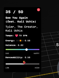
v3
- Mentioned total number of songs (13/50) to provide more context
- Mentioned actual values and paired them with visual bars
- Added micro animations for engagement
.png)
v4
- Highlighted the song's rank since the page is now titled "Top 50 Global", giving users enough context without repeating information.
- Differentiated song name and artist
- Redesigned the bars for consistency purposes
Design decisions & Why they matter
3D Spatial Placement
Helped users see patterns across playlist emotionally and rhythmically
Color + Motion
Translated raw data into mood and intensity
Micro animations
Created emotional “wow” moments without overwhelming new users
Intercept Testing
I ran intercept testing with 12+ participants. Many users were positively surprised by the visual language, calling it 'refreshing' and 'unlike anything I’ve seen before.'
Reactions included:
"I didn’t expect this to be music-related, but once I got it, it felt magical."
"It’s like discovering music in a new dimension.


Refinements
The test highlighted friction in navigation and the importance of adding lightweight onboarding and subtle cues to guide exploration without compromising the mystery and delight of discovery.
01. Ease in into the experience
Designed a landing page to provide context, instead of dropping the users straight into the visualization.


02. Guide how to navigate
Idea 1: Change the cursor design to a finger and the text "drag and move" appears when the cursor is static
But: Using a finger cursor can suggest a touchscreen experience

Before
After

02. Guide how to navigate
Idea 2: Introduce text labels in the bottom to clarify interactions.
Both of us mutually agreed to implement this idea


Driving Business Growth
01 Deepening user engagement
Turning passive listening into an immersive, multi-sensory experience. This emotional connection keeps users engaged longer and increases repeat visits or listening sessions, boosting retention and lifetime value.
03 Unlocking new product features
Soundscapes can be layered with interactive features like mood-based playlists, adaptive visuals, or user-controlled sound mixing. This not only adds perceived value but also creates opportunities for premium features, in-app purchases, or subscription tiers.
02 Community & social sharing
A visually distinct and emotionally rich soundscape invites users to share their listening experiences, playlists, or mood boards on social media. This organic word-of-mouth can fuel growth without heavy marketing spend.
04 Cross-selling & brand partnerships
Soundscapes can extend beyond music, integrating with wellness apps, retail environments, or events. For example, calming soundscapes could partner with meditation apps, or energetic playlists could sync with fitness platforms, opening new revenue streams and strategic collaborations.
Learnings
01 Helping users explore the unfamiliar
Designing for a 3D interface taught me the importance of subtle cues, clear instructions, and reassurance, especially when they're navigating something unfamiliar.
03 Designing for curiosity, not just tasks
This project wasn’t about solving a problem, it was about sparking exploration. I learned that good design doesn’t always need a goal; sometimes, its purpose is simply to inspire curiosity or joy.
02 Quick pivots, design <> dev
Collaborating with the developer taught me to adapt fast, testing early and balancing design intent with technical limits.
04 The power of emotional storytelling
Emotional storytelling makes experiences more inclusive and memorable, it helps designs resonate across diverse users, beyond just function.
Next in the Pipeline
-
Introduce scroll-triggered storytelling on the landing page to build intrigue and invite users into the Soundscape experience.

2. Populate data viz using unique user playlist data
3. Legend based navigation
4. Select song preview in the 3D space
The Team
Bhuvan Raj
Rahi Ranadive
NEXT PROJECT

