
Google Maps Mobile UX • Incremental Design
SOLO TRAVEL NAVIGATION
6 Weeks • 2022
TEAM OVERVIEW
1 Product Designer
MY ROLE
User Research • Field Study • Sensemaking • Strategy • Interaction Design • Visual Design
RESEARCH METHODS
Online Survey • User Interviews • Observation • Stepping into the shoes of user
THE CHALLENGE
How might we reduce confusion and anxiety for solo travelers navigating new destinations?
THE OUTCOME
An attempt to enhance the Google Maps mobile experience through a set of incremental improvements for a solo traveler exploring a new city.
Clear Textual & Visual Cues


Incorporating landmarks as a means of reassurance
Estimated distance in the format of Time?

Take the next right
| 01 min

Maharshi Karve Rd, Pune
Provide geographical context
The following data is extracted from an online survey distributed on social media. Total Participants : 127
Need Evaluation
The Users can be categorized as,
71% use the app while driving a 4 wheeler
Can use voice navigation
24% use it daily
28% use it while riding a 2 wheeler
Difficult to view the screen
19% use it 1x or 2x a week
Have become familiar with the interface
27% use it while walking
Access to view screen
58% use it only when travelling to a new place
Struggle with visual cues
Who actually navigates via Google Maps?
41% rely on their companion for directions
Access to view screen
59% use the navigation app on their own
Multitasking = high accident risk
Area of Opportunity
01. Solo navigation with optimized routes and fewer distractions
02. Provide more personalized and context-aware features
03. Introduce tools that promote safer, more efficient travel
Target Group
2 wheeler riders who travel alone
+
who interact with the product while driving the vehicle
User views on current UX
RISK
Have to pause the journey, stop the vehicle from time to time to check the further route
It gets difficult to gauge the distance at which you have to take a turn. eg : 250m, 80m etc
RISK
Generally take one good look at the whole route first before departing, then use my earphones and rely on the voice instructions
Difficult to use when driving alone
It is little difficult especially if you have to navigate via mobile app instead of dashboard system
RISK
When i am riding a bike it's quite a task, removing the phone from my pocket and looking at the maps or if my earphones are plugged in i use the voice command for directions
Pain Points
.png)
.png)
.png)
78% have missed turns despite following directions
27% people who miss the required turn struggle with meter-based distance cues
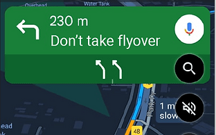
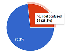
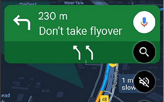
Nearly 50% are unsure whether to take the upcoming flyover
Persona
Vihaan Gupta • Solo Explorer
Age: 26 • A Mass Media graduate • Works as a Copywriter • Loves to travel solo • Writes blogs about his adventures • Seeks authentic experiences


Analysis of the current interface

Accessibility
Effective use of color contrast and opacity highlights the correct turn to take.
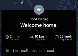
Personalization
The user receives a personalized and welcoming experience when the voice greets them as they arrive home.

Lacks location accuracy
Lal Bahadur Shastri (LBS) Road appears in multiple cities, so the app should also display the specific area, such as Bhandup, for clarity.
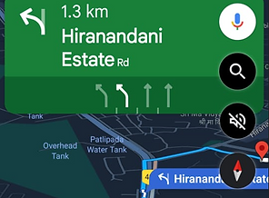
Text vs Visual Cue
The map shows a right turn, while the navigation suggests a left, causing confusion due to the lack of sync between the two.

Unclear Next Action
It displays navigation for the next 2 km instead of immediate directions, and users aren’t notified about upcoming flyovers.
Small Changes, Big Impact
01 Clear Instructions on Top
Clarity whether to take the flyover, with an arrow guiding the user to the left lane.
02 Textual + Visual Cues
Sync navigation arrows with map directions for consistency.


03 Incorporating Landmarks
Display the brand logo of the nearest landmark for reassurance.

04 Provide Context
Clear display of the name of the road and the area or locality for better orientation and guidance.
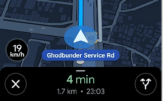
Maharshi Karve Rd, Pune
05 Distance as Time
Along with the total travel time, maps will estimate and display the time required for each turn, such as "Take the next right in 210 meters (or 1 minute)" based on vehicle's speed.

Take the next right
| 01 min
In conclusion, this approach focuses on minimizing app interactions to create a smoother, less distracting experience for solo travelers.
NEXT PROJECT

